DELIVERABLE IBRAND IDENTITY PLAYBOOK
WORK · 2026.07.30
Happiness Handmades
A Cairo jewellery house, one pair of hands, one seal. A feeling. A stone. One piece. Identity and both surfaces built on that law.
- TIER
- CLIENT
- ROLE
- Creative director
- DELIVERABLES
- BRAND IDENTITY PLAYBOOK · WEBSITE · SHOPIFY THEME
- YEAR
- 2026
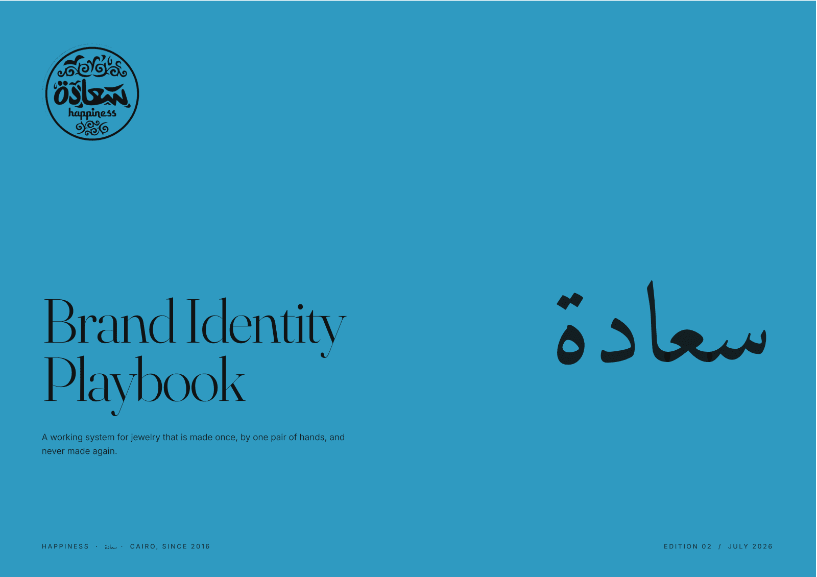
The brief
Happiness Handmades has worked out of Cairo since 2016. The whole identity is in six words: A feeling. A stone. One piece. Jewellery made once, by one pair of hands, and never made again.
The idea
The system had to carry that warmth without sentimentality across two surfaces at once: a custom website and a storefront. The identity separates tone from texture. Tone is conversational, direct, unhurried. Texture is tactile: the seal, the medallion mark in Happiness Teal, stamps every surface from box to tag to favicon.
The system
Edition 02 of the playbook is the authority both surfaces were built against. The first edition's numbers had changed everywhere: type scale, spacing, radius, the stone palette. So this was not a polish pass. Every value traces to a page in the playbook, and where the older site and the playbook disagreed, the playbook won. Two languages, one temperature: the Arabic and the Latin share the same warmth.
The surface
One language, two surfaces. The website reads as an editorial page first and a catalogue second. The storefront carries the same system. The seal lands the same way on a favicon and on a dispatch note.
Status
Identity, website, and storefront delivered. The playbook is the operating system for whatever comes next: seasonal pieces, wholesale collateral, new surfaces. Everything inherits the seal.